Create Control Chart In Excel
Introduction to Control Charts in Excel

Control charts are a powerful tool used in statistical process control to monitor and control processes. They help in identifying whether a process is in a state of statistical control or not. In this post, we will explore how to create a control chart in Excel, which is a widely used spreadsheet software.
Understanding Control Charts
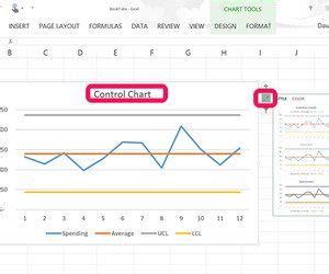
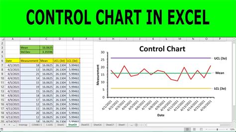
Before diving into creating control charts in Excel, it’s essential to understand the basics of control charts. A control chart typically consists of: - Center Line (CL): The average of the process data. - Upper Control Limit (UCL): The maximum limit beyond which the process is considered out of control. - Lower Control Limit (LCL): The minimum limit below which the process is considered out of control. - Data Points: The actual data plotted over time.
Steps to Create a Control Chart in Excel
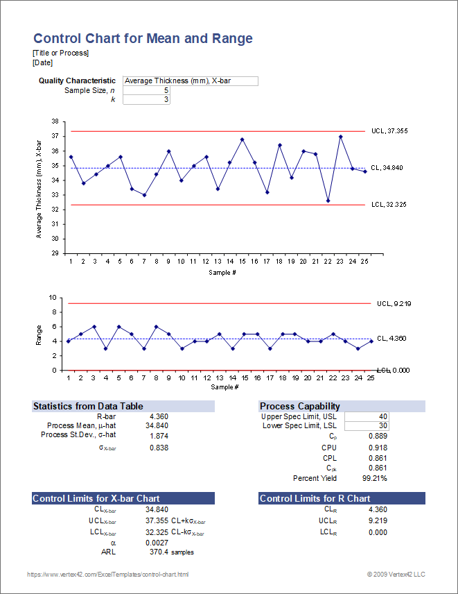
To create a control chart in Excel, follow these steps:
Prepare Your Data: Ensure your data is organized in a table format with time intervals (e.g., days, hours) in one column and the corresponding measurement or data point in another column.
Calculate the Center Line (CL), UCL, and LCL:
- CL: Calculate the average of your data points.
- UCL and LCL: These can be calculated using formulas that depend on the type of control chart you’re creating (e.g., X-bar chart, R-chart). For an X-bar chart, UCL = CL + (A2 * R-bar) and LCL = CL - (A2 * R-bar), where A2 is a constant that depends on the sample size, and R-bar is the average of the ranges of the subgroups.
Plot the Data:
- Select your data including headers.
- Go to the “Insert” tab in the ribbon.
- Choose “Line” or “XY Scatter” to create your chart, depending on the nature of your data and preference.
Add Center Line, UCL, and LCL:
- After creating the basic line chart, you can add the CL, UCL, and LCL as additional series.
- For each line (CL, UCL, LCL), add a new series to the chart by right-clicking on the chart and selecting “Select Data”.
- In the “Select Data Source” dialog, click “Add” and then in the “Edit Series” dialog, for “Series values”, enter the cell range containing your CL, UCL, or LCL values, respectively.
Format the Chart:
- Right-click on each series (CL, UCL, LCL) in the chart and select “Format Data Series”.
- Adjust line styles and colors to differentiate between the series clearly.
Example of Creating a Control Chart

Let’s consider an example where we have daily production quantities of a product, and we want to create an X-bar control chart to monitor the production process.
| Day | Production Quantity |
|---|---|
| 1 | 100 |
| 2 | 105 |
| 3 | 98 |
| 4 | 102 |
| 5 | 101 |

Assuming the CL is 100, UCL is 110, and LCL is 90, we plot these lines along with our daily production quantities on the chart.
Interpreting the Control Chart

- In Control: If all data points fall within the UCL and LCL, the process is in control. - Out of Control: Points outside the control limits or non-random patterns within the limits (e.g., trends, cycles) indicate the process is out of control, suggesting a need for corrective action.
📝 Note: The interpretation of control charts requires understanding the context of the process and the nature of the data being plotted.
To ensure the process remains stable and within desired limits, regular monitoring and analysis of the control chart are necessary.
In summary, creating a control chart in Excel involves preparing your data, calculating the center line and control limits, plotting the data, adding the center line and control limits to the chart, and formatting the chart for clarity. By following these steps and understanding how to interpret the chart, you can effectively monitor and control your processes.
The ability to monitor processes closely allows for quick identification of deviations, enabling timely corrective actions to be taken. This proactive approach can significantly improve the quality and consistency of output in various industries.
To further enhance your understanding and application of control charts, consider exploring different types of control charts, such as the R-chart for monitoring variability and the p-chart for monitoring proportions.
In final thoughts, mastering the creation and interpretation of control charts in Excel is a valuable skill for anyone involved in process management and quality control. It offers a straightforward yet powerful method for ensuring that processes operate within predetermined limits, contributing to overall efficiency and product quality.
